- Site
- telljoan.com, a phone-call biographer for families
- Serif
- Vigil Serif, roman and italic, set at 360 for display
- Sans
- Vigil, roman only, for the interface
- Replaced
- Newsreader and Outfit, on
- Files
- Three variable woff2s, self-hosted, Latin subset
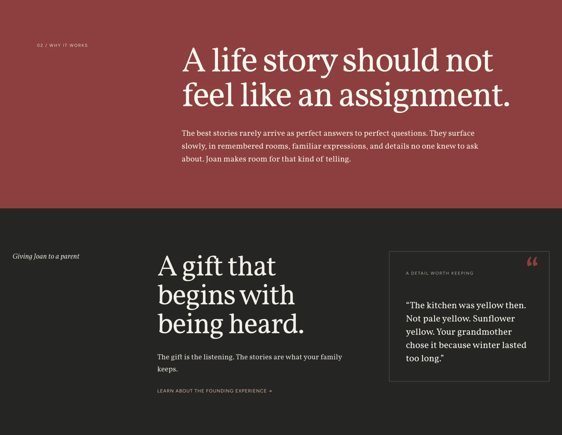
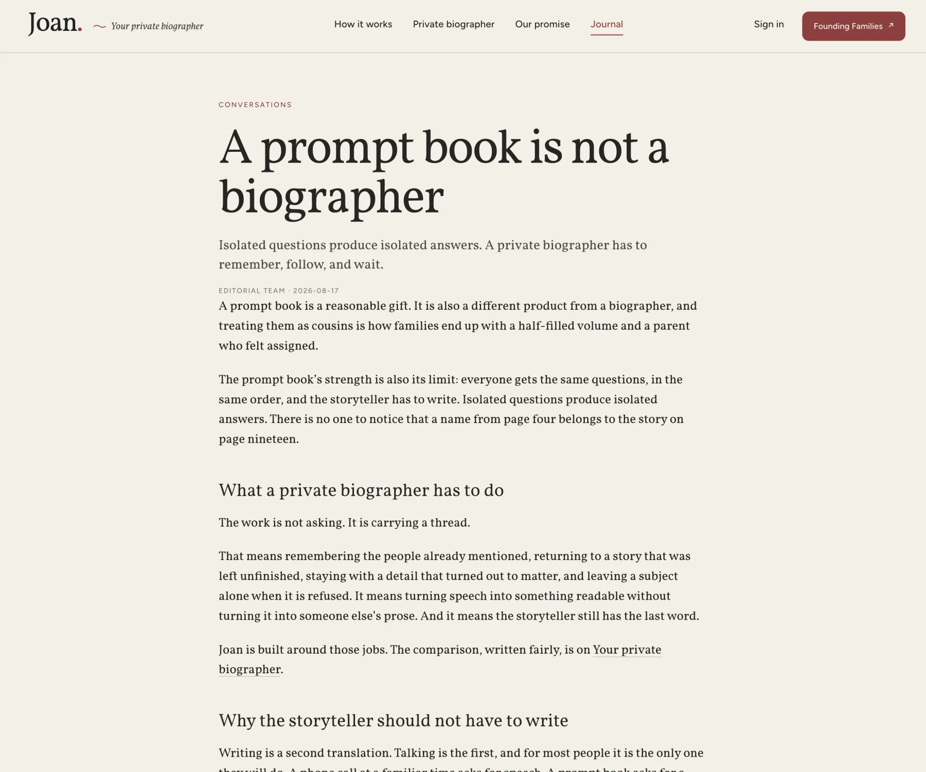
Full disclosure: Joan is mine too. It’s also the first real product set entirely in Vigil and Vigil Serif, and a font page that only shows its own specimens is asking you to take its word for it. So here is a site with forms, a nav, an FAQ, long articles and a phone mock-up, with nothing on it set in anything else.
Joan calls a storyteller at a time they choose, asks about their life, and writes down what they say. The audience is adult children buying for a parent, and the parent, who is often in their seventies or eighties. That second reader is why the type mattered. It has to feel like a book and it has to read on a phone held at arm’s length.
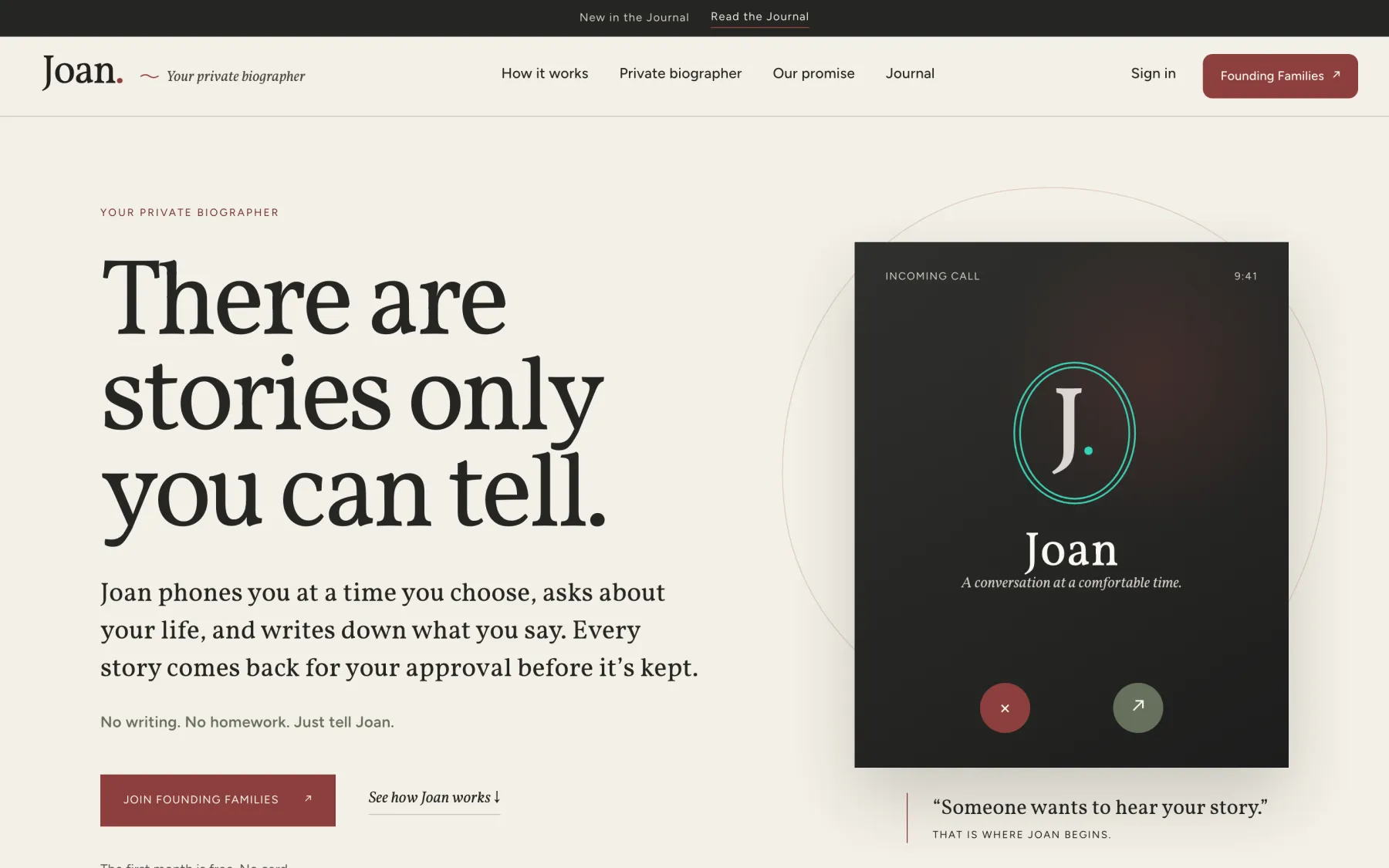
Content in the serif, interface in the sans
The rule is the one on the Vigil Serif page, followed literally. Anything Joan says is serif. Anything you operate is sans.
What Joan says
- Every headline
- Body copy and Journal articles
- The italic tagline and text links
- Pull quotes and the FAQ questions
- The name on the incoming call
What you press or scan
- Navigation and buttons
- Tracked uppercase eyebrows
- Step numbers and section labels
- Form labels and choice chips
- The one-line refrain under the hero
Because the two share a cap height, x-height and line box, nothing needed nudging where they meet. The eyebrow sits on top of a 120px serif headline, the button sits beside an italic serif link, and the baselines line up because they were drawn to.
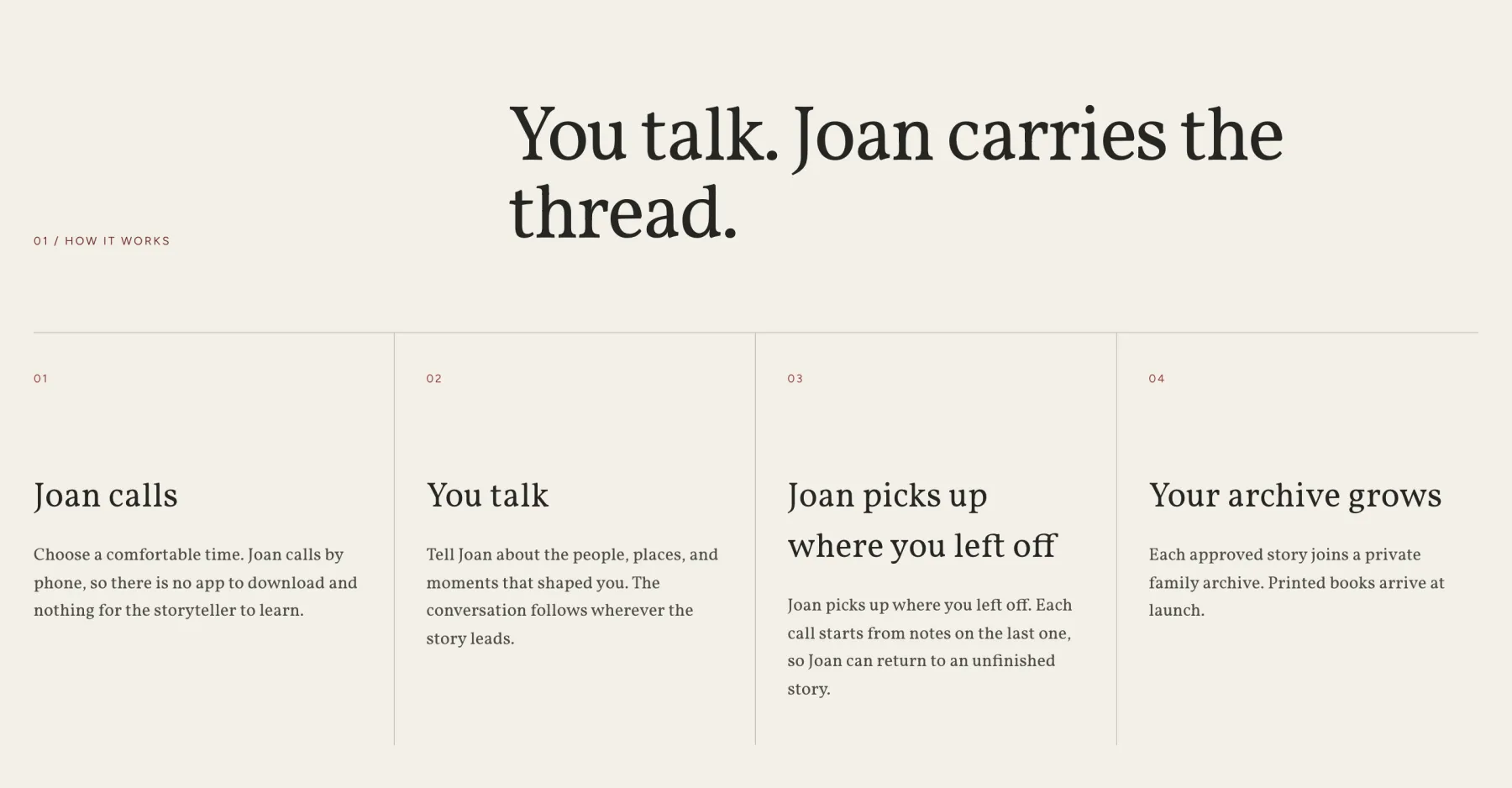
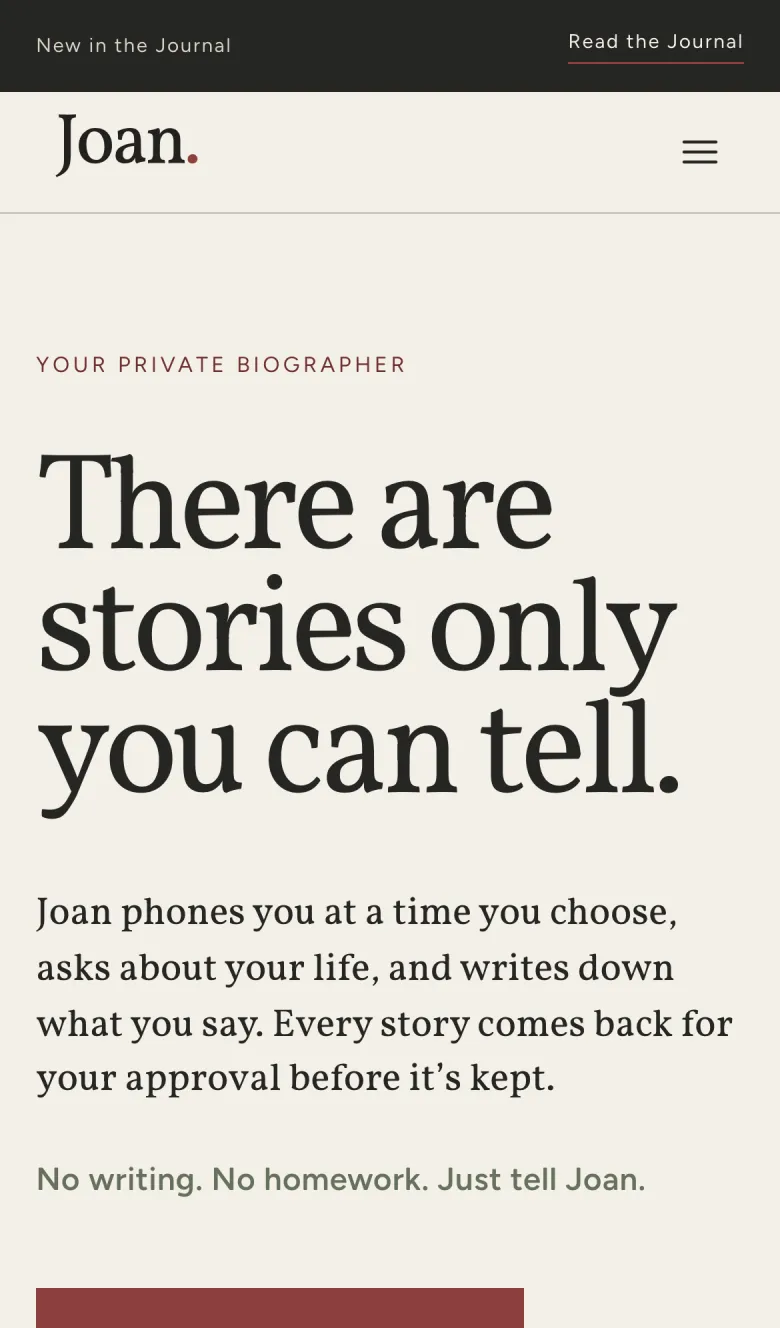
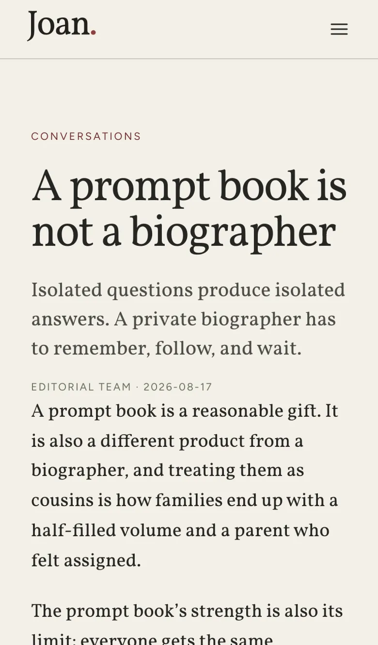
One number fixed the colour
Joan’s headlines were designed in Newsreader at 400. Dropping Vigil Serif in at the same 400 made every heading look like it had raised its voice. Measured on a clean stem, Vigil Serif 400 is 10.2% thicker than Newsreader 400. The match is 360.
That number only exists because the serif is variable. With static weights the choice is 300 (too thin) or 400 (too loud). With the axis it is one custom property, --display-weight: 360, and every heading on the site moved together.
The J got longer
Joan’s wordmark is the word Joan. with a claret full stop. Vigil Serif’s J drops well below the baseline, as a book face’s J should, and the logo file grew a tail: 29 of its 114 pixels now sit under the baseline, against 11 in the old mark. Left alone, that tail pushed the header taller and the wordmark off-centre from its tagline. The fix was to let the descender hang out of the layout box, with six pixels off the top. The header stayed the height it was.
It’s the most typographic bug I have ever filed, and the right trade. A J that stops at the baseline is a sans habit.
Three files
Joan is a Next.js site and it self-hosts the fonts rather than hotlinking vigil.css, because the routine that writes its Journal builds in a sandbox with no network. Each file is one variable face over the full 200–900 axis, cut to Latin:
- Vigil Serif
- 125 KB, roman, 200–900
- Vigil Serif Italic
- 104 KB, italic, 200–900
- Vigil
- 35 KB, roman, 200–900
There is no sans italic. Nothing on the site sets the sans in italic, so it isn’t shipped. Fallback metrics are matched to Times New Roman and Arial so the page doesn’t jump when the fonts land.
If you’re doing the same
- Split by job, not by size. Serif for what the product says, sans for what the reader does.
- Swapping from another serif? Match stem weight, not the number. Joan’s 400 became 360.
- Check every J, Q and descender in your logo and anything with a fixed height.
- Ship the variable file. Three files covered every weight and slope Joan uses.
Set something in Vigil? Send it in. Good uses go up here, credited and linked.